For this project, our client was a financial planning app that had recently launched a new goal tracker feature. Unfortunately, user feedback and analytics indicated that the feature was confusing and difficult to navigate.
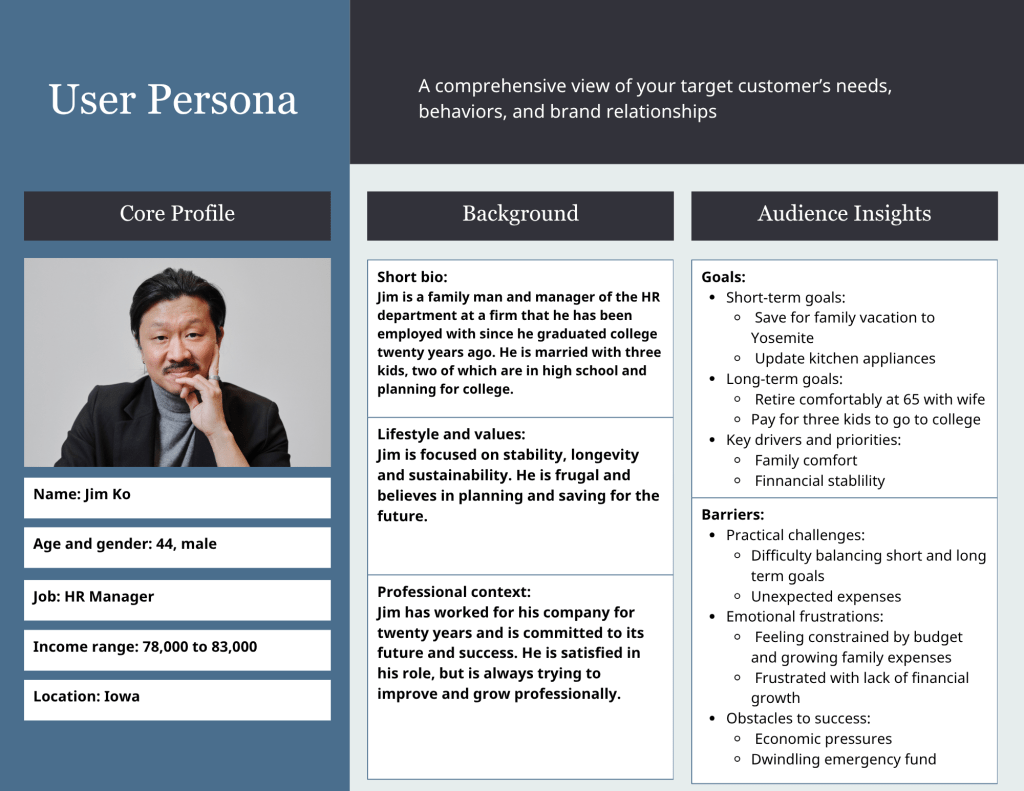
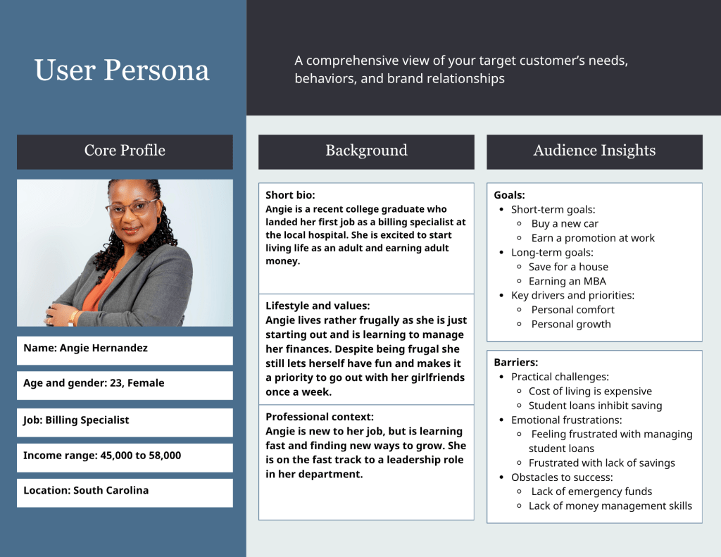
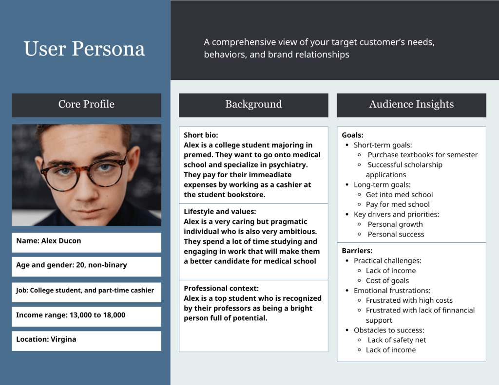
To better understand user behavior, I developed three user personas representing key segments of the app’s user base. Using these personas, I designed and conducted a usability test to identify specific pain points in the goal tracker feature.
The usability testing revealed that users experienced information overload and difficulty understanding how to update and track goals. Based on these findings, I led the development of a wireframe that simplified the interface, reduced visual clutter, and improved navigation.
This redesign directly addressed the usability issues identified in testing and provided a clearer, more intuitive user experience.
Select User Personas, Usability Test Protocol or Wireframe to see the final results.
User Personas
Usability Test Protocol
Testing Methodology
Testers will be recruited from a current database of users. In order to qualify users must have used the app for at least a week. Users weill be asked to sit for a moderated usability session, where they talk through the assigned tasks. An interviewer or moderator will sit with them taking notes, asking clarifying questions as they complete the tasks, and ask established open-ended questions listed in the interview guide below.
Phase 1: General App Use
Before starting the usability test the interviewer should ensure the tester is comfortable, understands what is expected of them, and how the testing will go. The interviewer will answer any questions that the tester will have. The interviewer will also clarify that the session will take roughly 20 to 25 minutes, and the tester can ask questions at any point during the test. Part 1A: Natural App Usage
Task:
“Please open the app and talk me through how you would normally use it.”
Interviewers should observe how the testers interact with the app, how they navigate through the features, and note navigation tools and interaction pattern. Over the course of the demonstration the interviewer should ask the following questions:
- What do you typically use the app for?
- Is anything difficult to find?
- Which features do you use most frequently? Why is that?
- Do you avoid using any features? If so, why?
Task: “Please rank the features you use from most frequently to least frequently.”
Interviewer will provide tester with a list of features, and a pen and paper for the tester to rank the features. Observe how long it takes the tester to rank the features, and note where the goal tracker sits on the list. When they are done ask the following questions:
- Why did you rank them this way?
- Why do you use this one the most?
- Why do you not use these as much?
Metrics:
· Self-reported feature frequency
· Feature satisfaction
· Tracker rank position
· Awareness of available features
Part 2: Goal Tracker Walkthrough
Task: Ask “Imagine you want to save $1,000 for a vacation. Show me how you would set that up in the app.”
For each Goal Tracker task, the moderator will record how long it takes to complete a task; task success rate; navigation errors, and visible signs of hesitation, irritation or frustration. After completing the task the interviewer will ask a series of questions listed below. After this task the interviewer should ask:
- Was anything unclear during that process?
- How did you find creating a goal?
- What, if anything did you like about the process of creating the goal?
- What could make this easier?
- What could improve this?
Task: “Can you now talk me through how you would update the goal.” ● Was anything unclear during that process?
- What did you think of the process of updating the goal?
- What did you like about updating the goal?
- What could make this easier?
- What would make updating the goal more enjoyable?
Task: “Last task, can you now talk me through how you would complete the goal.” ● Was anything unclear during that process?
- What did you think of the process of completing the goal?
- What did you like about completing the goal?
- What would make completing the goal easier on the app?
- What would make completing the goal on the app more enjoyable?
Metric:
· Task completion rate (%)
· Time on task (seconds)
· Number of navigation errors
· Number of moderator assists required
· Observed frustration or hesitation
Task: “Alright, that’s it for now, you can close out the app. I still have a few more questions for you.”
The interviewer should ask the following questions:
- How do you feel after interacting with the goal tracker feature? Why do you feel that way?
- What do you think about the goal tracker feature now that you’ve interacted with it?
- Would you continue to use the goal tracker as it is? Why or why not?
- What did you like about the goal tracker?
- What would make the goal tracker better?
- Would you recommend the goal tracker feature to anyone? Why or why not?
- Is there anything else you would like to talk about, related to the app or the goal tracker that we have not already discussed?
Metric:
Overall satisfaction with goal tracker
Wire Frame
https://static-bundles.visme.co/visme-embed.jsMade with Visme
Explanation of Wireframe
Based on feedback from usability testing, we designed a revised wireframe to address the key pain points identified by current and recent users. Most of the problems identified during testing were related to the goal tracker, which aligned with earlier feedback and analytics. Usability testing revealed that the goal tracker feature was overwhelming, with dense visuals, excessive text, and too many options. This made it difficult for users to understand what they were viewing, how to update goals, and which information was most important. The redesigned interface simplifies the process.
The following sections describe the proposed design changes, starting with the main screen for the goal tracker. When users select the goal tracker feature from the drop-down menu on the home screen they will go to the main “Goal Tracker” screen. They will see a list of their goals and the goal’s status. At the bottom of the list there will be a “Create goal” button. They will not see all the details of the goal unless they select a specific goal to look at, update or complete. This structure reduces information overload and improves usability.
If the user chooses to create a goal, they will be taken to a new screen with four customization options. This includes the title of the goal, what type of goal it is, the amount of money they want to set for the goal, and the option to set a deadline. This is information that the testers indicated was important to them. In the current version they stated that the other options were confusing, unimportant, and were often ignored by the testers. Focusing on these areas we have been able to streamline the screen, increase engagement, and minimize confusion.
Usability testing revealed that testers were frustrated with the original requirement that they set a deadline for the goal, and found this feature irritating. As a solution, we made the goal deadline an optional feature. If the user selects the “Deadline” button it will take them to a separate screen with options related to setting a due date or deadline for the goal, along with the option to have it repeat.
Making it a separate screen keeps the “Create goal” screen streamlined.
To update a goal the user will be taken to a screen with the status of the goal. This will include the title of the goal; the original goal total; the optional deadline; current goal status; and a button for completing the goal. In the usability test the testers indicated the original goal, deadline, and current progress were the most important focus when updating their goal. The usability test indicated that having an option to update their goals and having visuals was important. However, the current version has too many visuals showing the same information and testers said it is confusing. The redesigned interface includes two visuals: a progress bar showing the time remaining until the deadline and a circular progress indicator showing goal completion.
A significant update is the “Complete goal” button, which allows users to clearly mark a goal as finished. Our testers indicated frustration with the current version because when they update their goal it doesn’t automatically mark the goal as complete but doesn’t give them the option to indicate the goal is complete. While there technically is a button to mark the goal as “complete” it is a small icon in the top right corner and all the testers were unaware of its existence. Making the “Complete goal” button bigger, marking it clearly and putting it in the bottom center of the screen makes it more visible to the user.
The final screen is a notification confirming that the goal has been completed, making it clear that the goal has been successfully updated. This was suggested to us by the testers. This confirmation screen provides clear feedback to the user and reduces uncertainty about whether the goal has been successfully completed.
